pacman::p_load(tmap, sf, tidyverse, sfdep, knitr, plotly)In-Class Exercise 2C: Emerging Hot Spot Analysis
Using sfdep package
1 Overview
For this task , we will be learning how to perform Emerging Hot Spot Analysis (EHSA) using the sfdep package.
EHSA is a spatio-temporal analysis method for revealing and describing how hot spot and cold spot areas evolve over time. The analysis consist of four main steps:
Building a space-time cube,
Calculating Getis-Ord local Gi* statistic for each bin by using an FDR correction,
Evaluating these hot and cold spot trends by using Mann-Kendall trend test,
Categorising each study area location by referring to the resultant trend z-score and p-value for each location with data, and with the hot spot z-score and p-value for each bin.
2 Getting Started
We will first load the necessary packages using the following code chunk:
- tmap: for thematic mapping
- sf: for geospatial data handling (e.g. importing and exporting for spatial data and geoprocessing)
- tidyverse: a family of R packages for non-spatial data handling
- knitr: to generate static html tables
- sfdep: to calculate spatial weights and matrices, space time cube and hot spot analysis
- plotly: to make the graphs interactive
3 Preparing the Geospatial Data
3.1 Importing the data
hunan <- st_read(dsn = "data/geospatial", layer="Hunan")Reading layer `Hunan' from data source
`C:\sihuihui\ISSS624\In-class_Ex\In-class_Ex2\data\geospatial'
using driver `ESRI Shapefile'
Simple feature collection with 88 features and 7 fields
Geometry type: POLYGON
Dimension: XY
Bounding box: xmin: 108.7831 ymin: 24.6342 xmax: 114.2544 ymax: 30.12812
Geodetic CRS: WGS 84From the above outcome, we know that hunandata is simple feature (sf) data frame with 88 features (each representing 1 geographical entity), and each feature is a polygon.It uses the WGS84 projection.
4 Preparing the Aspatial Data
4.1 Importing the data
GDPPC <- read_csv("data/aspatial/Hunan_GDPPC.csv")Let us take a look at the GDPPC data.
kable(head(GDPPC))| Year | County | GDPPC |
|---|---|---|
| 2005 | Longshan | 3469 |
| 2005 | Changsha | 24612 |
| 2005 | Wangcheng | 14659 |
| 2005 | Ningxiang | 11687 |
| 2005 | Liuyang | 13406 |
| 2005 | Zhuzhou | 8546 |
5 Creating a Time Series Cube
We use spacetime() of sfdep to create a space time cube.
GDPPC_st <- spacetime(GDPPC, hunan,
                 .loc_col = "County",
                 .time_col = "Year")
Note that the “time” variable needs to be in ‘int’ or ‘num’ format when using spacetime().
We can use is_spacetime_cube() of sfedep package to verify if GDPPC_st is indeed a space time cube object.
is_spacetime_cube(GDPPC_st)[1] TRUEThe TRUE return confirms that GDPPC_st object is indeed an space time cube.
6 Computing Gi*
First we will compute an inverse distance weight matrix.
GDPPC_nb <- GDPPC_st %>%
  activate("geometry") %>%
  mutate(nb = include_self(st_contiguity(geometry)),
         wt = st_inverse_distance(nb, geometry, scale = 1,
                                  alpha=1),
         .before = 1) %>%
  set_nbs("nb") %>%
set_wts("wt")- activate() of dplyr package is used to activate the geometry context
- mutate() of dplyr package is used to create 2 columns nb and wt.
- Then we will activate the data context again and copy over the nb and wt columns to each time-slice using set_nbs() and set_wts().
- Note that row order is very important so do not rearrange the observations after using set_nbs() or set_wts().
The following output shows that this dataset now has neighbours and weighrs for each time-slice
head(GDPPC_nb)# A tibble: 6 × 5
Year County GDPPC nb wt
<dbl> <chr> <dbl> <list> <list>
1 2005 Anxiang 8184 <int [6]> <dbl [6]>
2 2005 Hanshou 6560 <int [6]> <dbl [6]>
3 2005 Jinshi 9956 <int [5]> <dbl [5]>
4 2005 Li 8394 <int [5]> <dbl [5]>
5 2005 Linli 8850 <int [5]> <dbl [5]>
6 2005 Shimen 9244 <int [6]> <dbl [6]>We can now use these new columns to calculate the local Gi* for each location. We can do this by grouping Year and using local_gstar_perm() of sfdep package. After which, we use unnest() to unnest gi_star column of the newly created gi_stars data frame.
gi_stars <- GDPPC_nb %>%
  group_by(Year) %>%
  mutate(gi_star = local_gstar_perm(GDPPC, nb, wt)) %>%
  tidyr::unnest(gi_star)
7 Mann-Kendall Test
With these Gi* measures, we can then evaluate each location for a trend using the Mann-Kendall test. The following code chunk using Changsha county.
cbg <- gi_stars %>%
  ungroup() %>%
  filter(County == "Changsha") |>
  select(County, Year, gi_star)
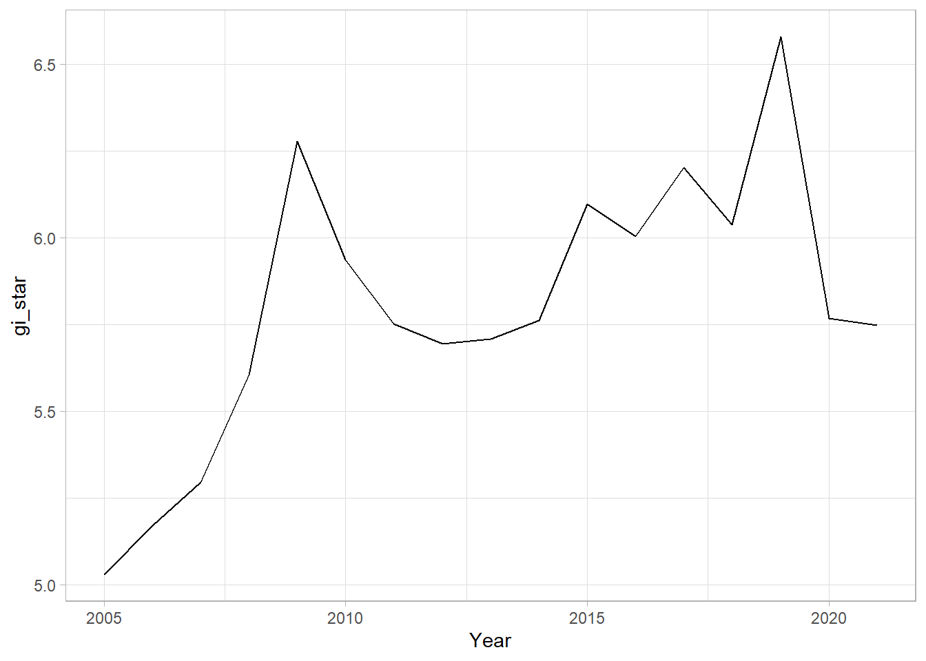
Next, we plot the result using ggplot2 functions.
ggplot(data = cbg,
       aes(x = Year, y = gi_star)) +
  geom_line() +
theme_light() 
p <- ggplot(data = cbg,
       aes(x = Year, y = gi_star)) +
  geom_line() +
  theme_light()

ggplotly(p)
cbg %>%
summarise(mk = list(
unclass(Kendall::MannKendall(gi_star)))) %>%
tidyr::unnest_wider(mk)# A tibble: 1 × 5
tau sl S D varS
<dbl> <dbl> <dbl> <dbl> <dbl>
1 0.485 0.00742 66 136. 589.In the above result, sl is the p-value, which is 0.007416964. This result tells us that there is a slight upward but insignificant trend.
We can replicate this for each location by using group_by() of dplyr package.
ehsa <- gi_stars %>%
  group_by(County) %>%
  summarise(mk = list(unclass(Kendall::MannKendall(gi_star)))) %>%
  tidyr::unnest_wider(mk)
8 Arrange to show significant emerging hot/cold spots
Now we will arrange to share the significant emerging hot/cold spots using the following code chunk.
emerging <- ehsa %>%
  arrange(sl, abs(tau)) %>%
  slice(1:5)
9 Performing Emerging Hotspot Analysis
We will now perform EHSA analysing using emerging_hotspot_analysis() of sfdep package. It takes a spacetime object (i.e., GDPPC_st)and the variable of interest (i.e., GDPPC) for .var arugment. The k argument is used to specify the number of time lags which is set to 1 by default. Lastly, nsim map numbers of simulation to be performed.
ehsa <- emerging_hotspot_analysis(
  x = GDPPC_st,
  .var = "GDPPC",
  k = 1,
  nsim = 99
)
10 Visualising the distribution of EHSA classes
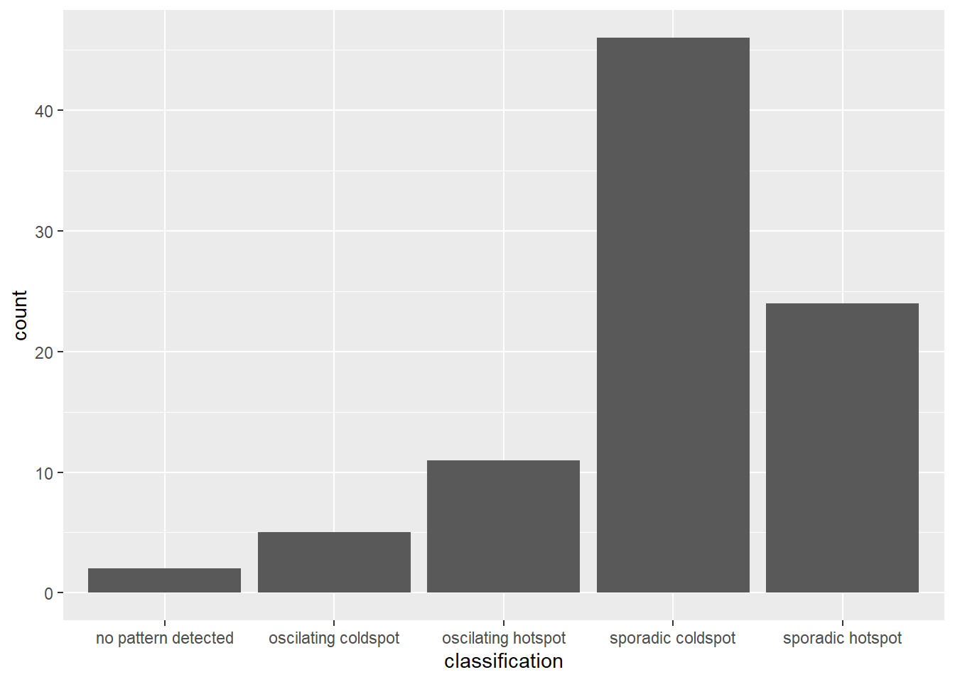
We use ggplot2 functions to plot the distribution of EHSA classes as a bar chart.
ggplot(data = ehsa,
       aes(x=classification)) + geom_bar()
The figure above shows that sporadic cold spots class has the highest number of county.
11 Visualising EHSA
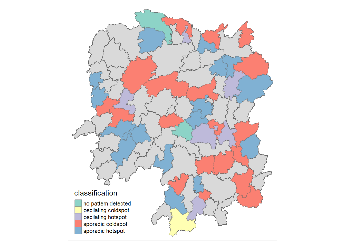
Before we visualise the geographic distribution of EHSA classes, we need to join both hunan and ehsa data together using the following code chunk.
hunan_ehsa <- hunan %>%
  left_join(ehsa,
            by = join_by(County == location))
Then, we will use tmap functions to plot a categorical choropleth map using the following code chunk.
ehsa_sig <- hunan_ehsa %>%
  filter(p_value < 0.05)
tmap_mode("plot")
tm_shape(hunan_ehsa) +
  tm_polygons() +
  tm_borders(alpha = 0.5) +
  tm_shape(ehsa_sig)+
  tm_fill("classification") +
  tm_borders(alpha = 0.4)